One of my main deliverables while working at iD Mobile was to work alongside a remote/offshore team to create an app which serviced customers of the newly formed mobile network.
There were many challenges, and many successes and failures from which I have learned a lot. This case study aims to look at some of the mistakes made and how I would rectify these today.
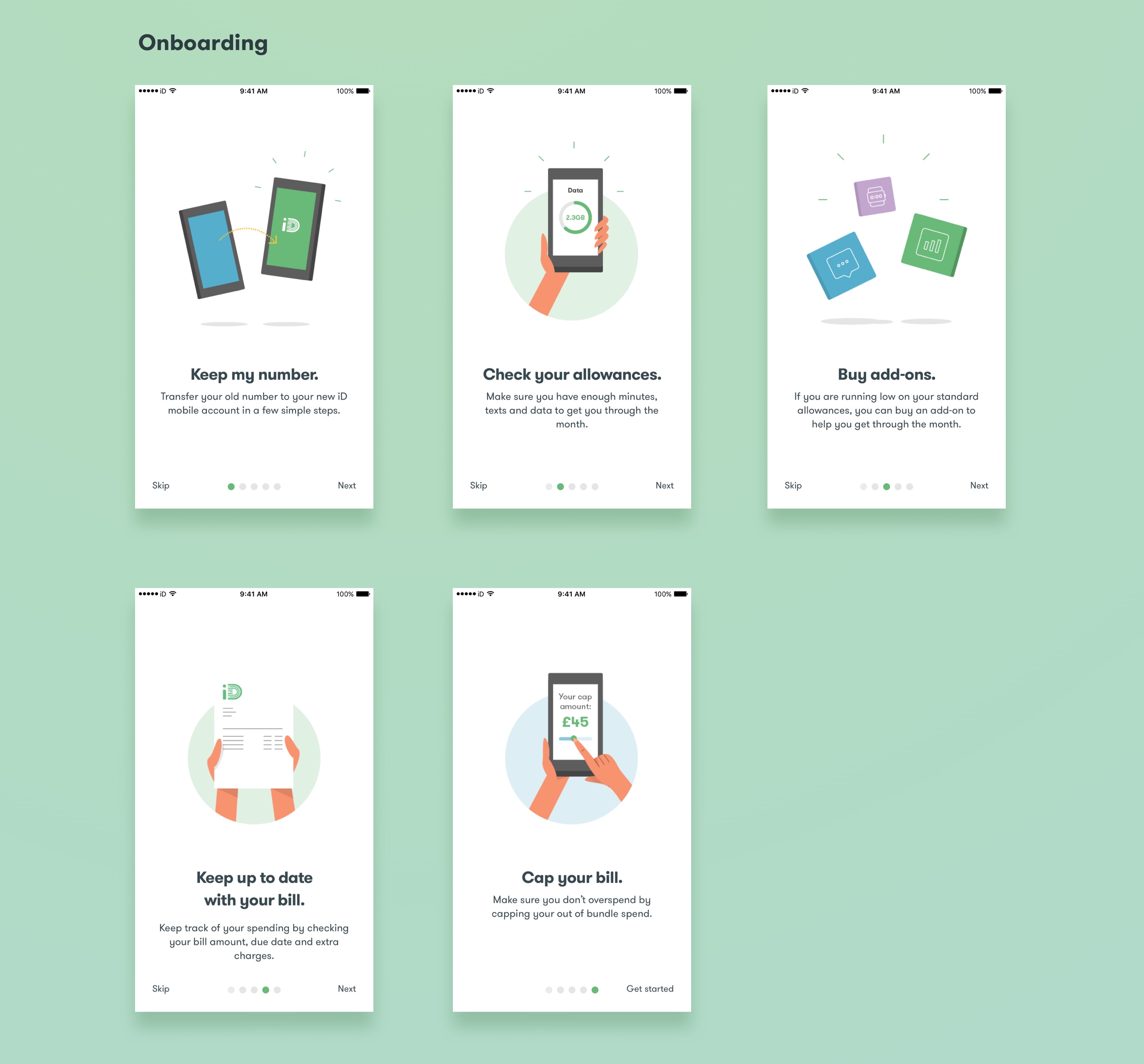
As with many projects, there wasn’t a lot of time to turn around the initial designs for the app. The business wanted something that helped to establish the iD brand and ultimately service the customer.
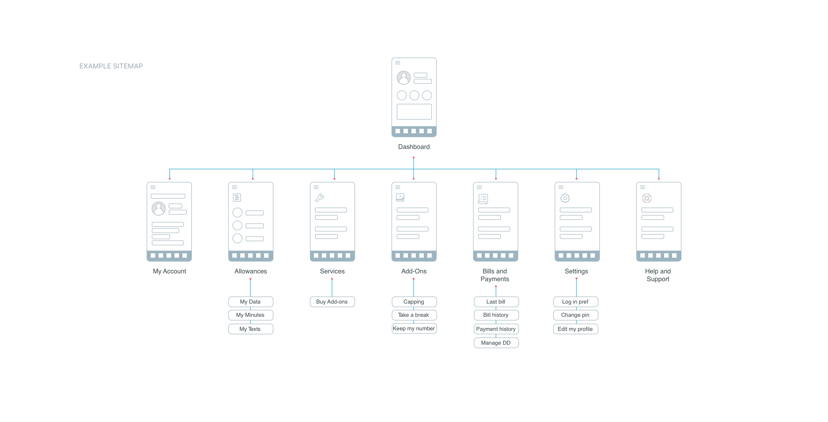
The user should be allowed to stay on top of their expenses and sell out-of-bundle add-ons. After some competitor analysis and card sorting exercises with a small group, we put together a site map and started to build some key customer journeys.
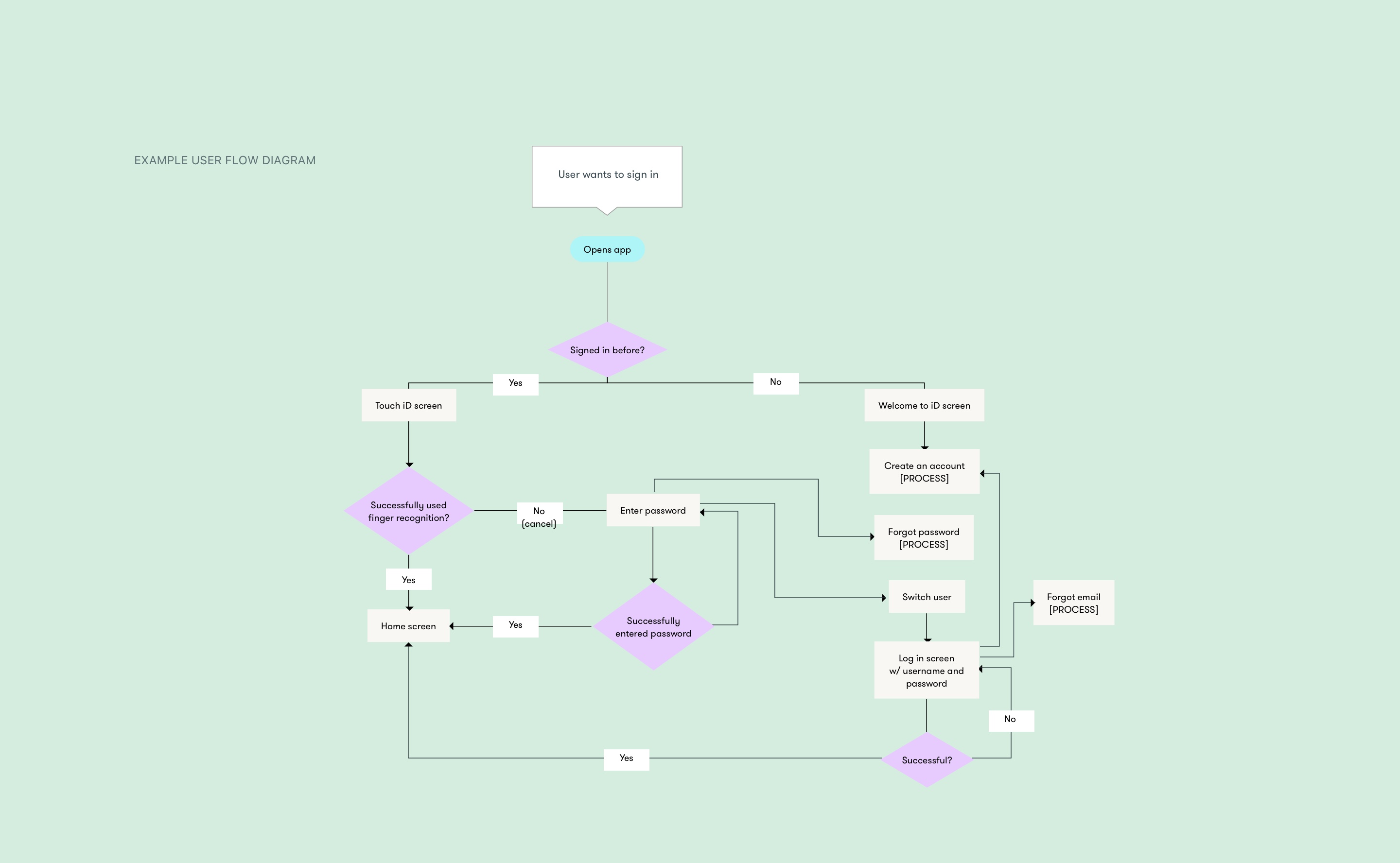
After listing out use cases, we created journeys which involved plotting user flows and planning for every eventuality in every given scenario.
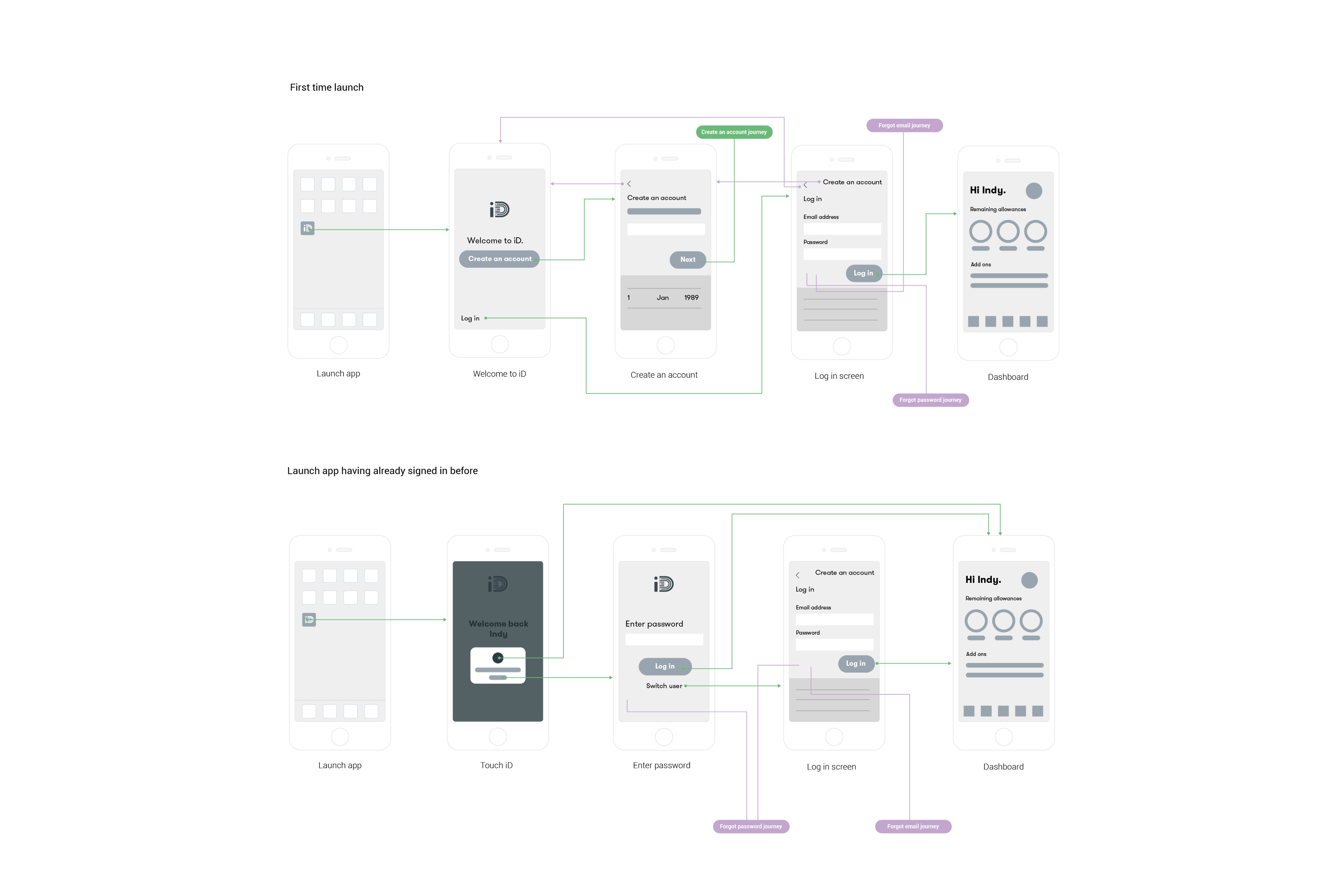
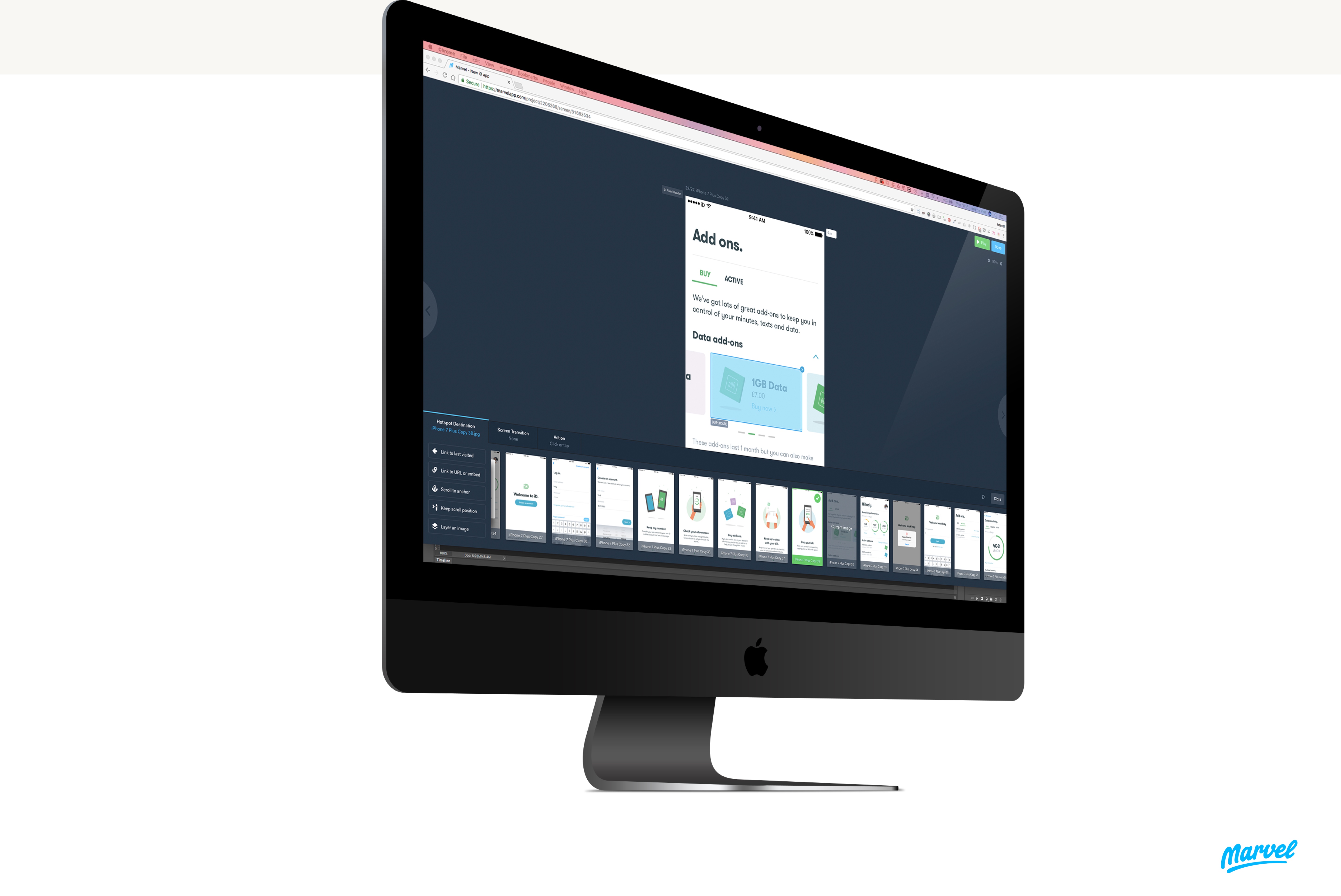
We used Marvel to quickly mockup journeys and get a prototype in the hands of our users to see how well the design solutions fared.
We had successes and failures which all informed the next steps of our design process.
Part of growing and evolving as a designer is being honest enough to learn from past mistakes. Here are some of my thoughts on the current iD app design.
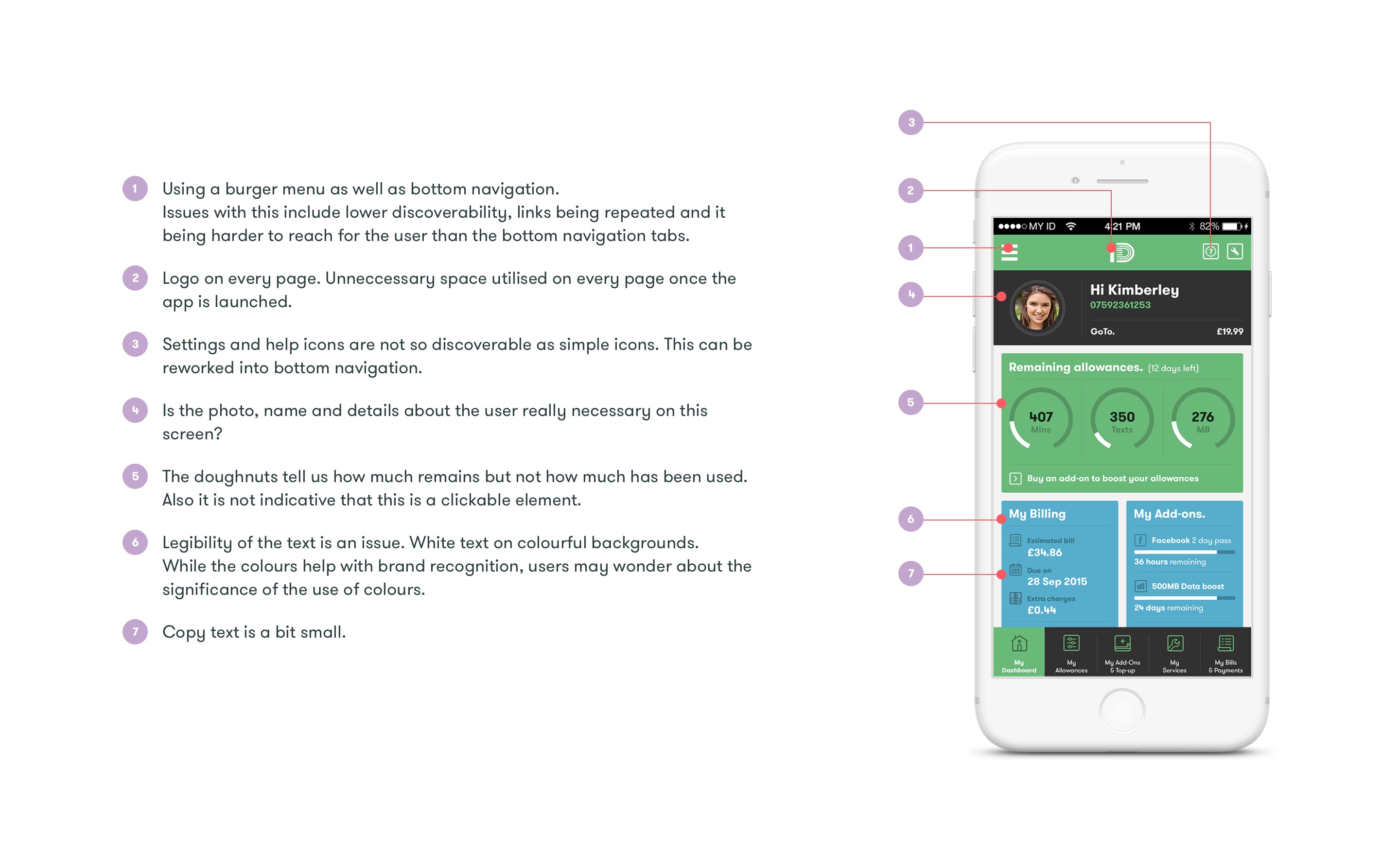
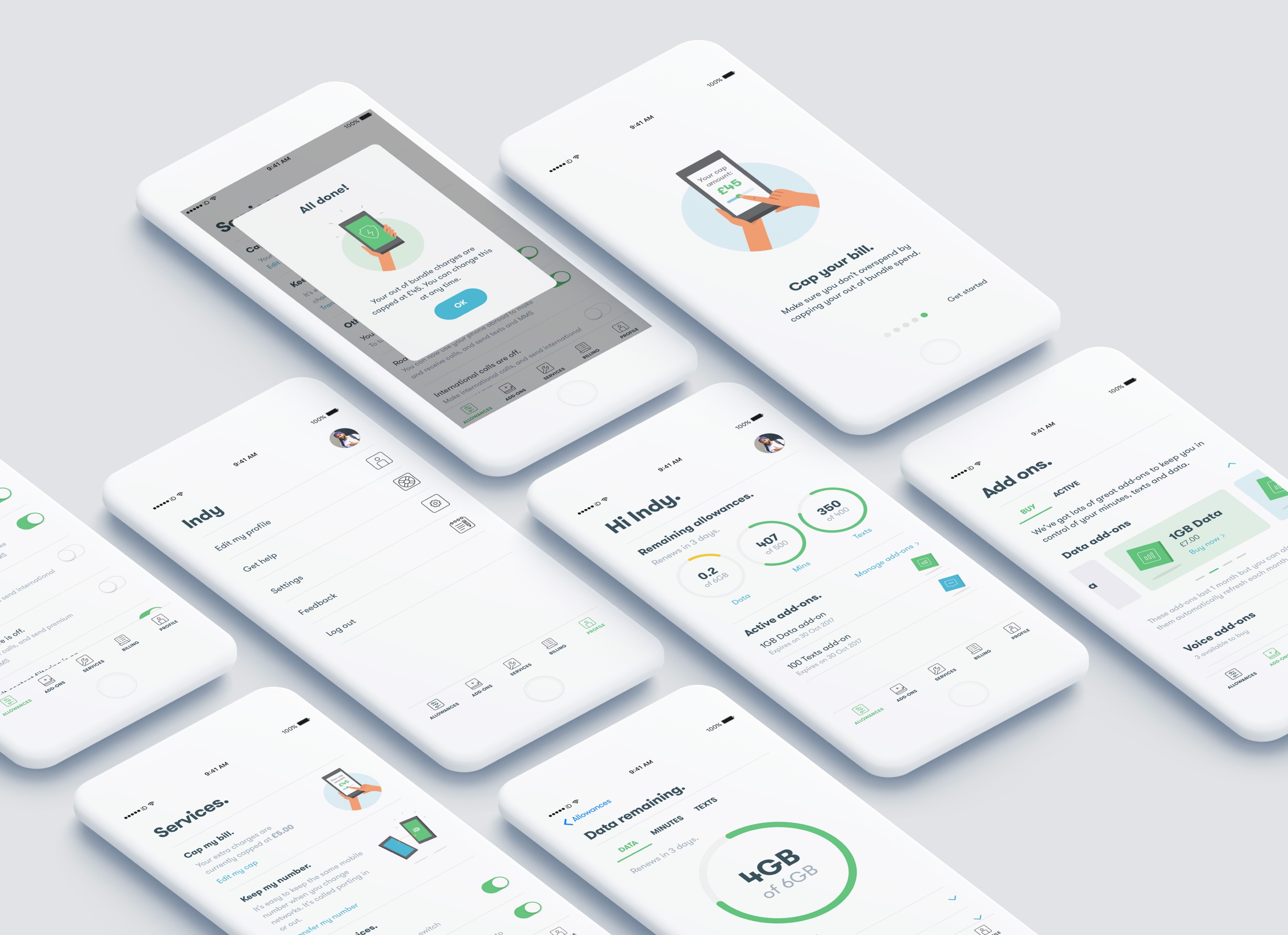
I feel it was unneccesary to use both the burger icon and tabbed navigation at the bottom and it led to some confusion as to what you could do with the app. Simplifying the navigation helped provide a more logical heirachy to information.
Surveys and interviews can help us learn much quickly but measuring true user intentions is another thing. We decided to build a landing page for gameplan with the intention of getting people to sign up. This would help us learn the true appetite amongst the existing member base for a financial product from giffgaff.
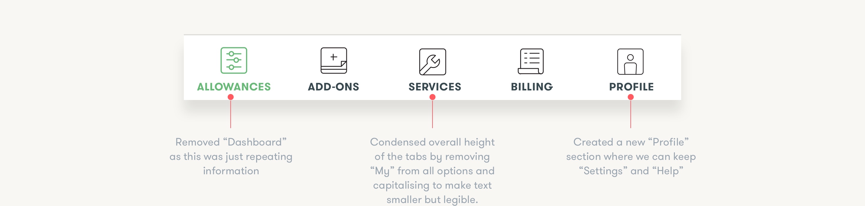
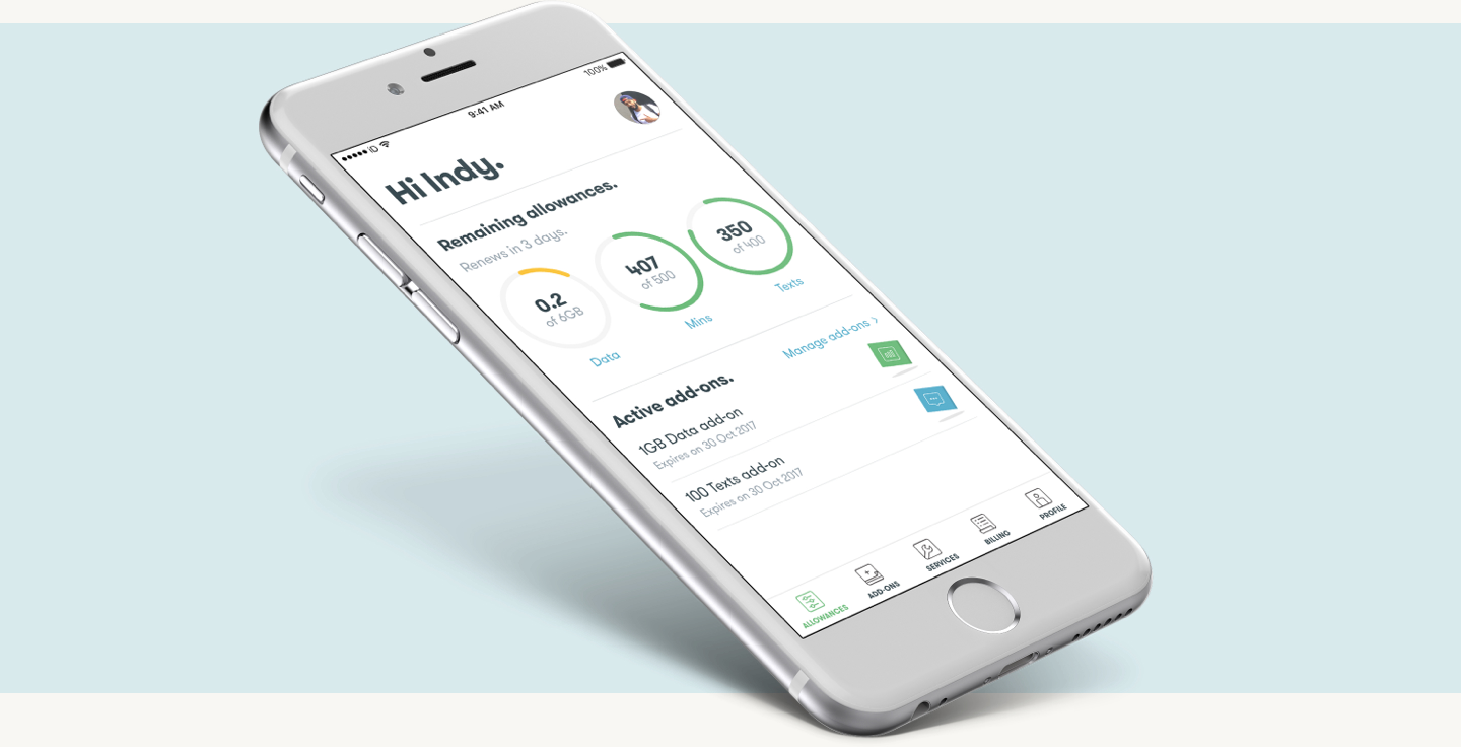
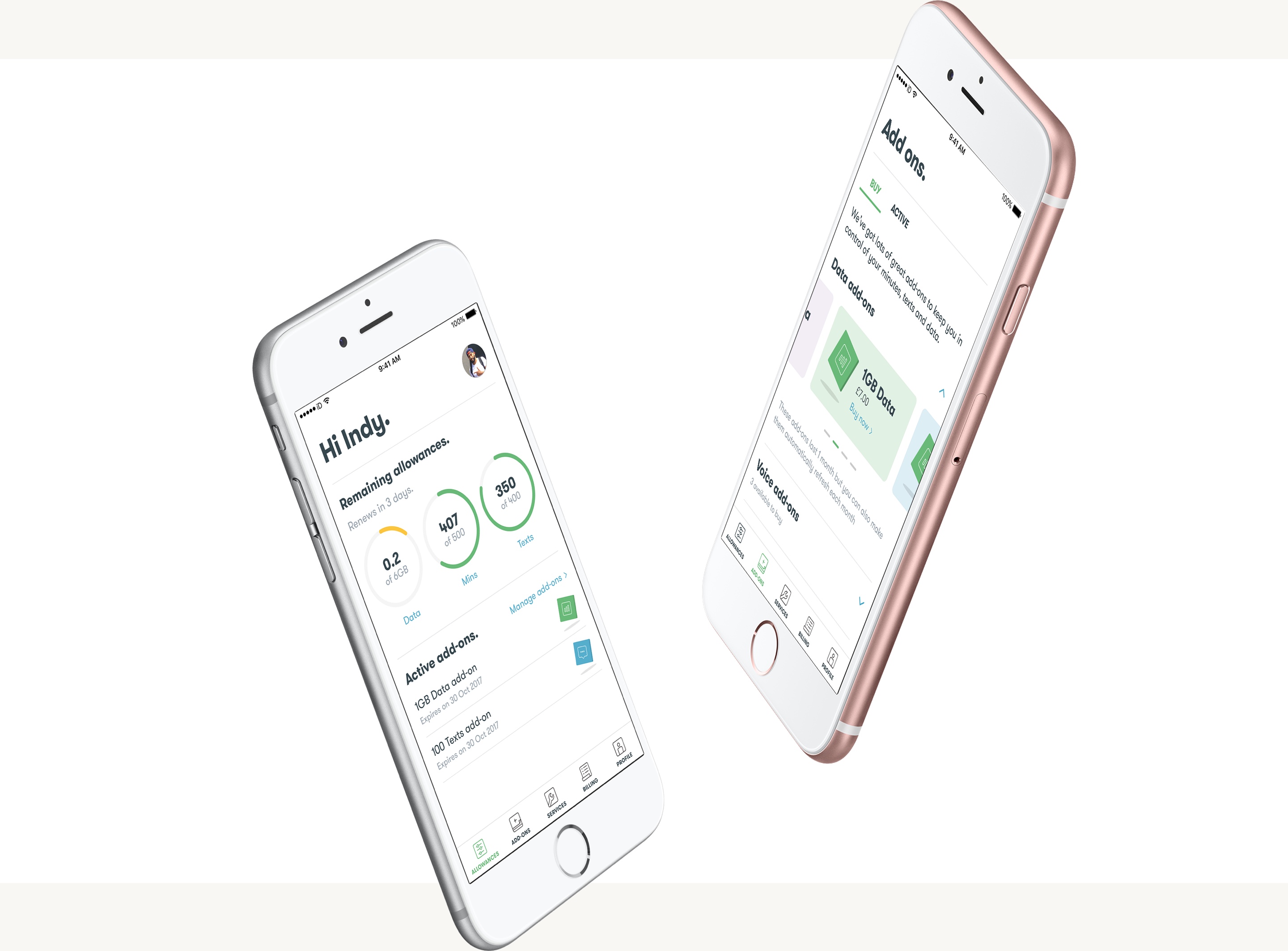
The main use case identified for the users was for them to check their remaining allowances. It made sense to get rid of the home dashboard screen and simply use the Allowances screen as a “home/landing” screen once the user initially logs in.
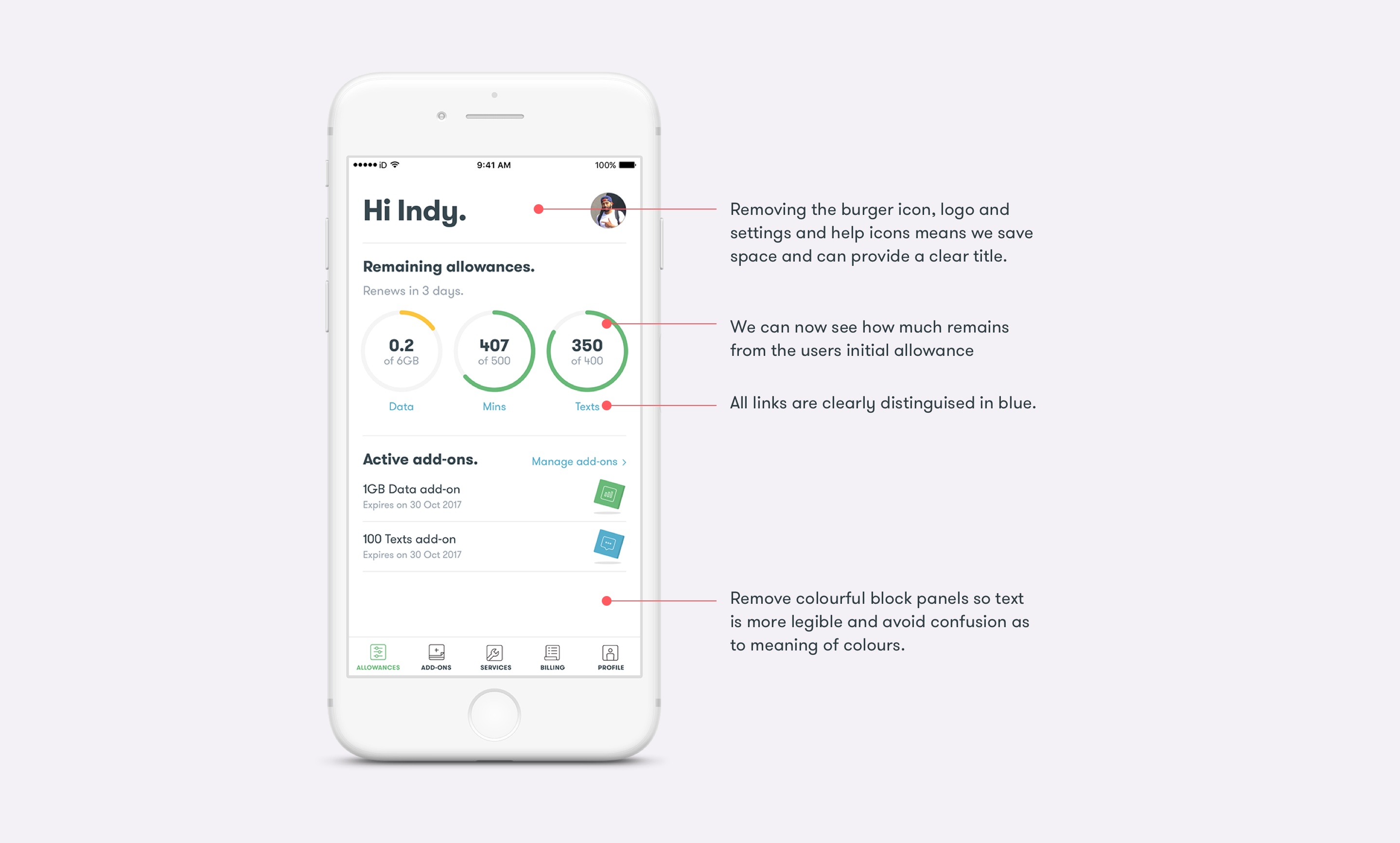
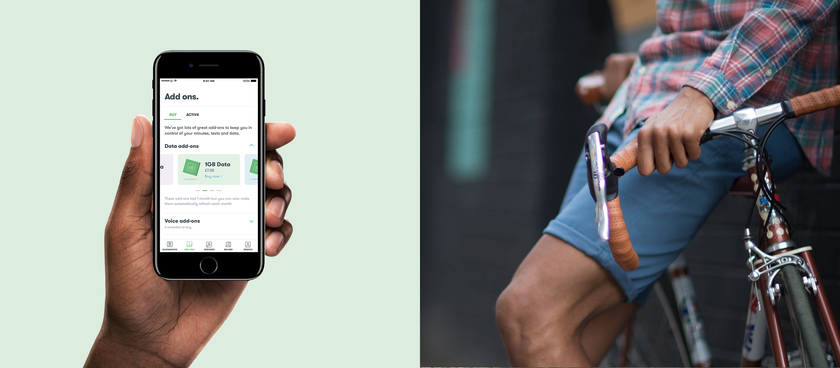
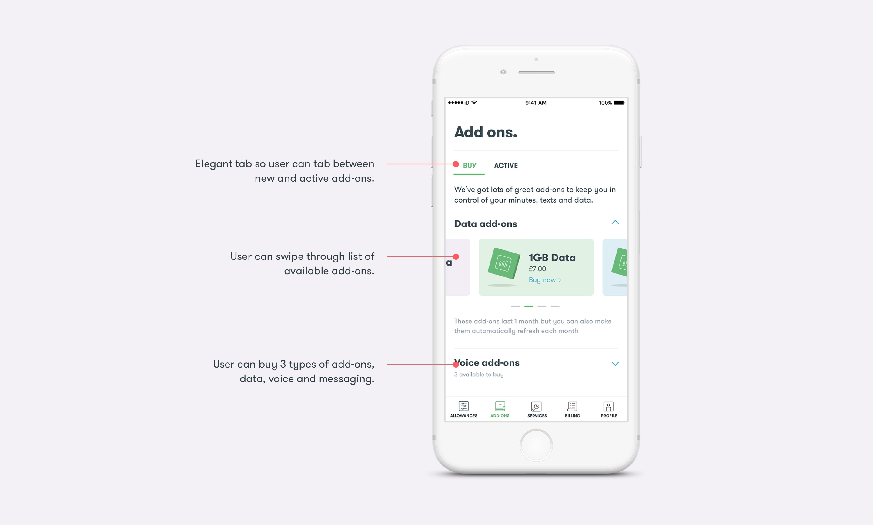
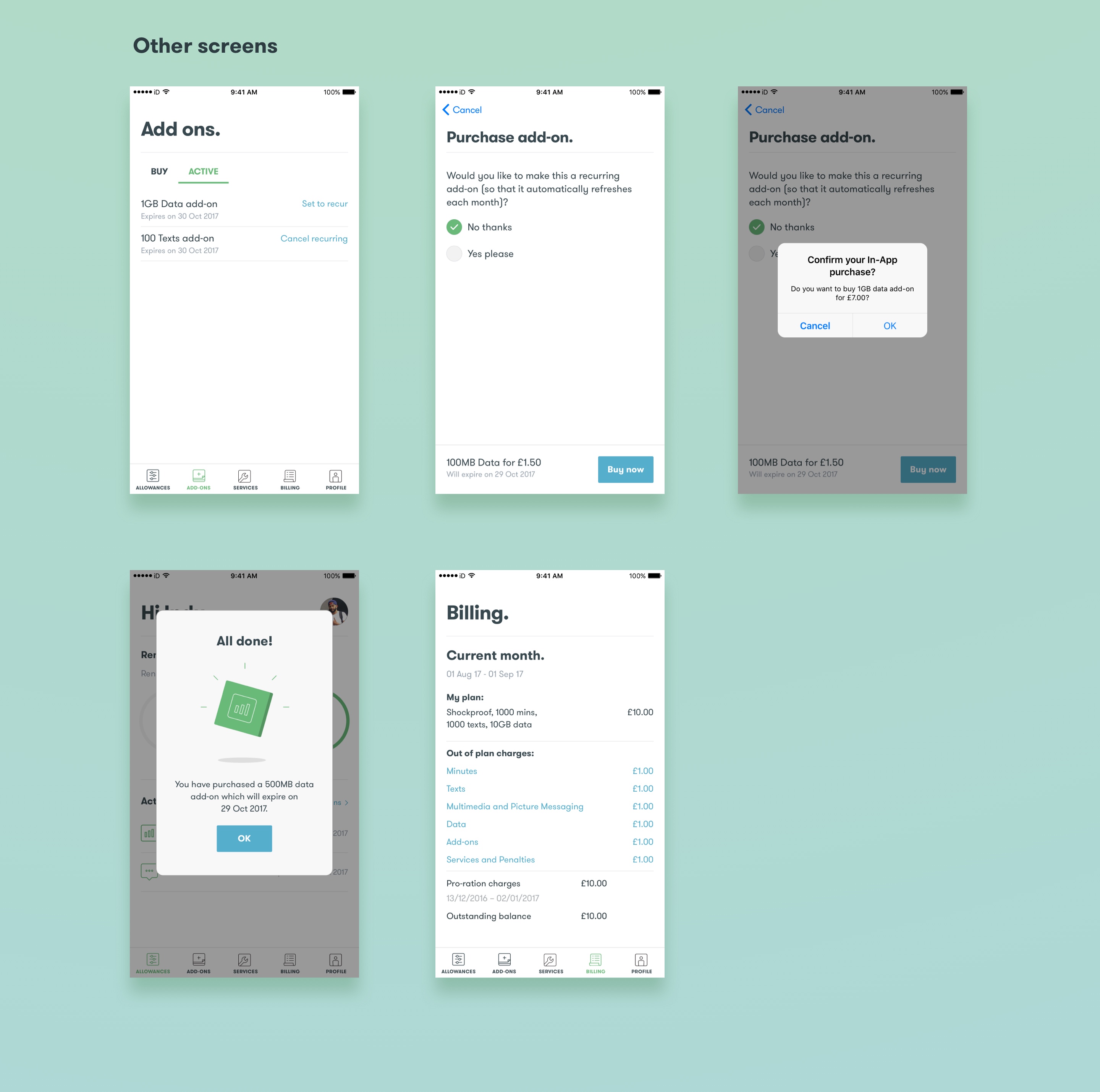
A key requirement for the business and for users was the option to purchase an add-on in the event that the user has used all her inclusive allowances. The updated UI clearly distinguishes between any “Active” add-ons (already purchased) and new add-ons to “Buy”.
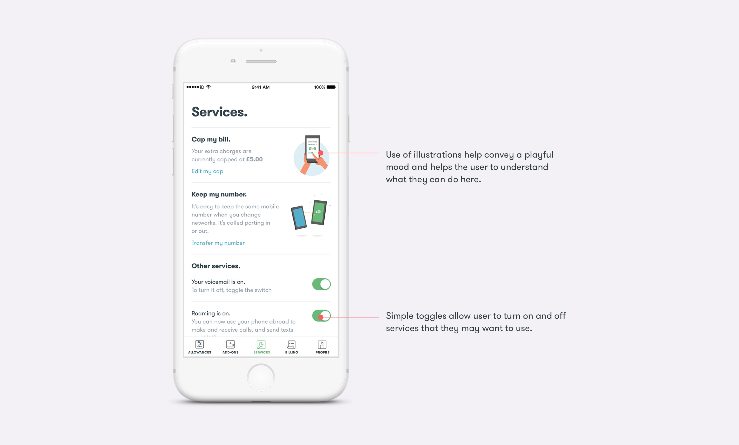
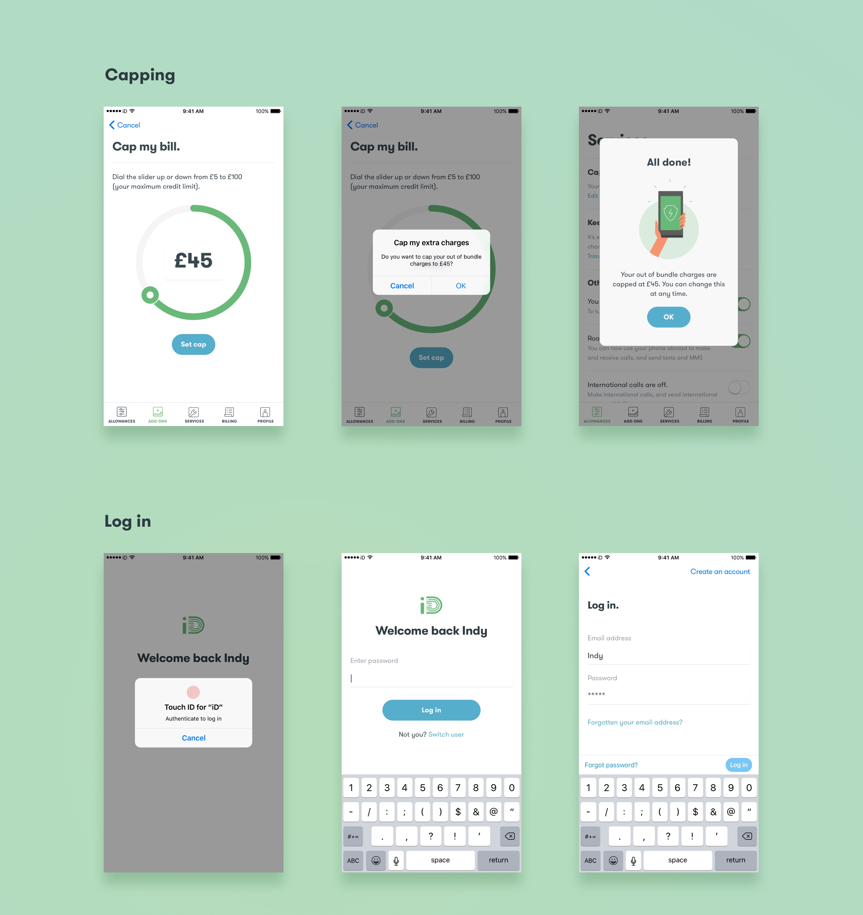
iD mobile offer a number of initiatives to their users including the ability to cap their out of bundle spend. They also allow for users to use the app to help transfer their existing number over to their new network provider.
As part of the self care stream it was important that users could turn on and off services through the app as opposed to calling up the call centre.
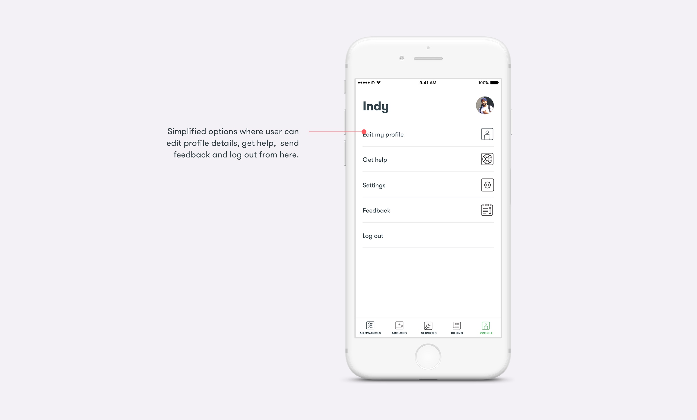
Having cleared up some room in the bottom navigation pane by removing Dashboard, it made sense to group all “Account, settings and help” sections under a new tab called “Profile”.
Using Principle and After effects I have put together some examples of how certain user flows would work. This gives us an example to show the subtle animation styles.