In 2013, O2 made the decision to update their portal website and improve the overall user experience of the site. Tribal DDB were chosen as the agency responsible for “rebuilding O2’s digital footprint”. I was contracted to O2 as a senior designer and worked alongside the talented folk at TribalDDB to redesign the new responsive website.
You would be forgiven for thinking there would be little room left for any creativity when operating within the confines of the business needs. However, there was an understandable drive for all of these components.
After an initial inception phase, the UX team at Tribal DDB begun to work up wireframes working with the designers to capture the unique brand. It wasn’t simply our task to colour in wireframes. Having an understanding of the brand was key and it was important not to lose this in the new digital space
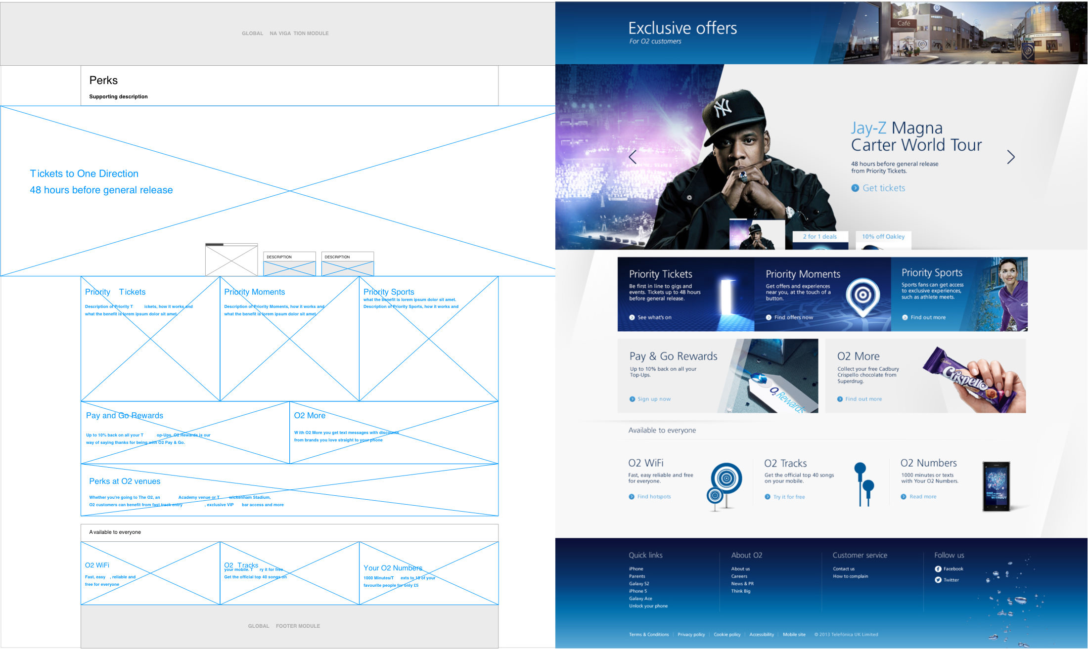
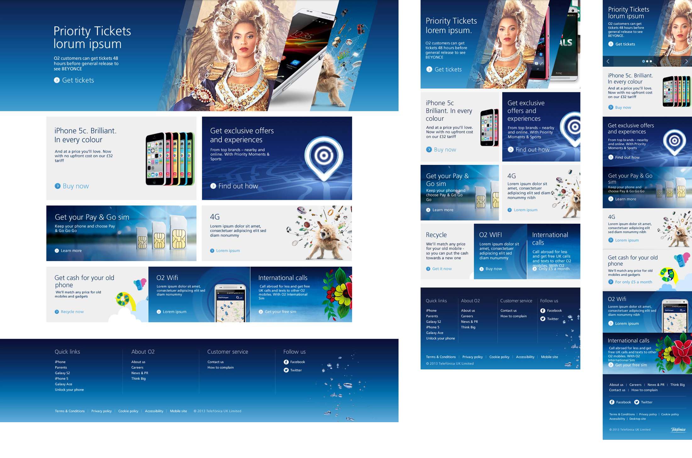
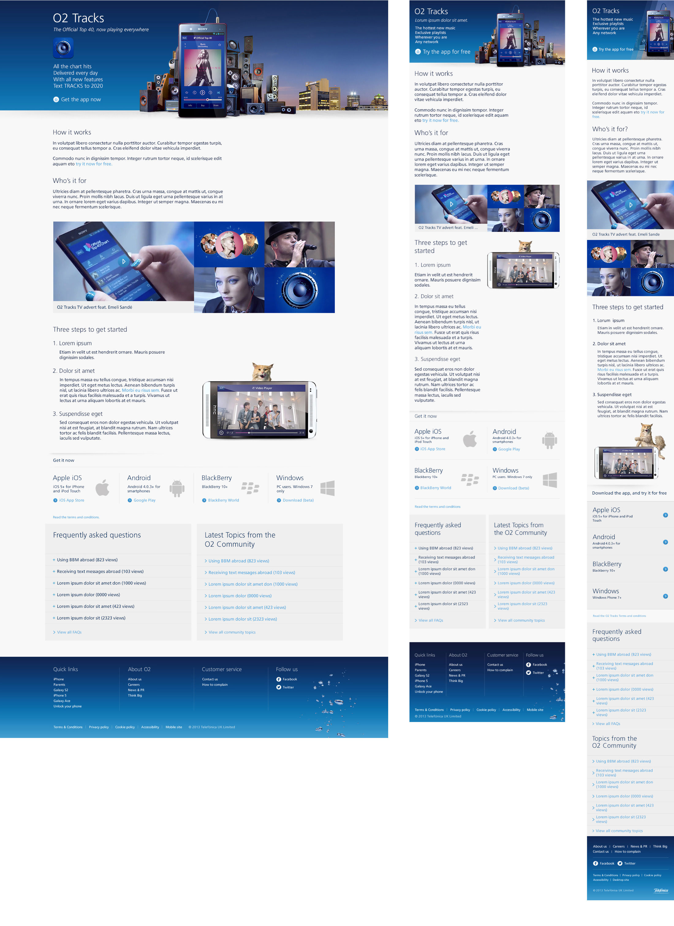
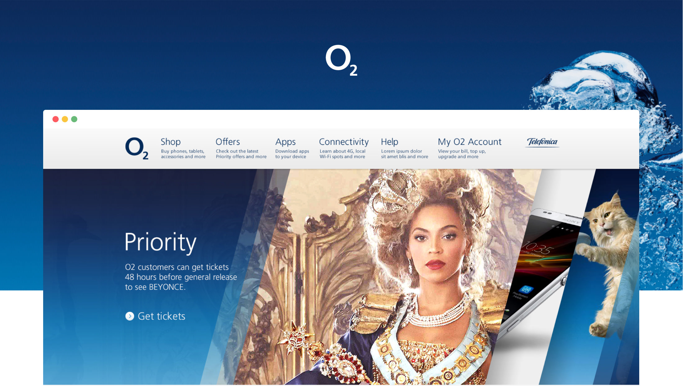
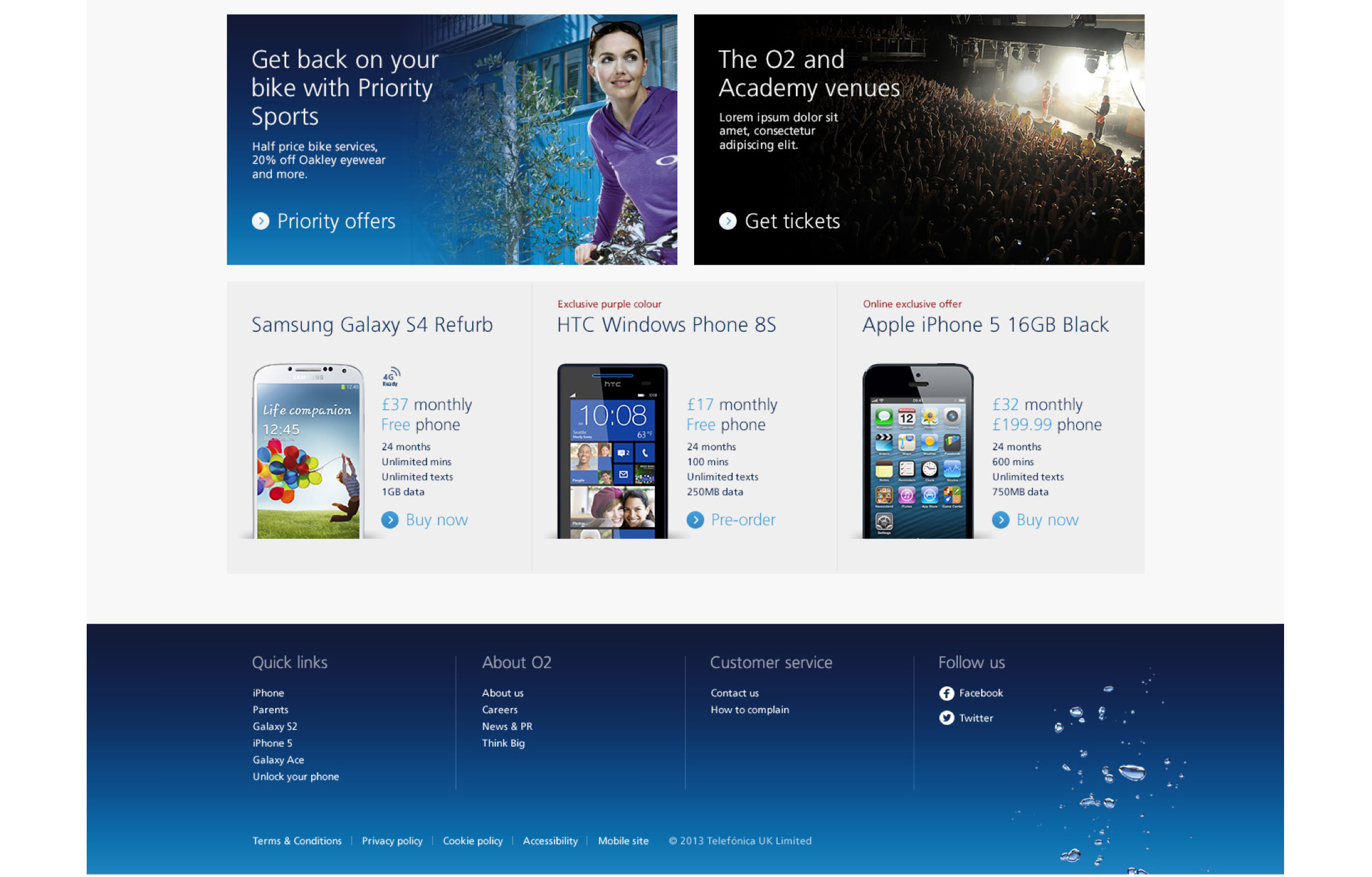
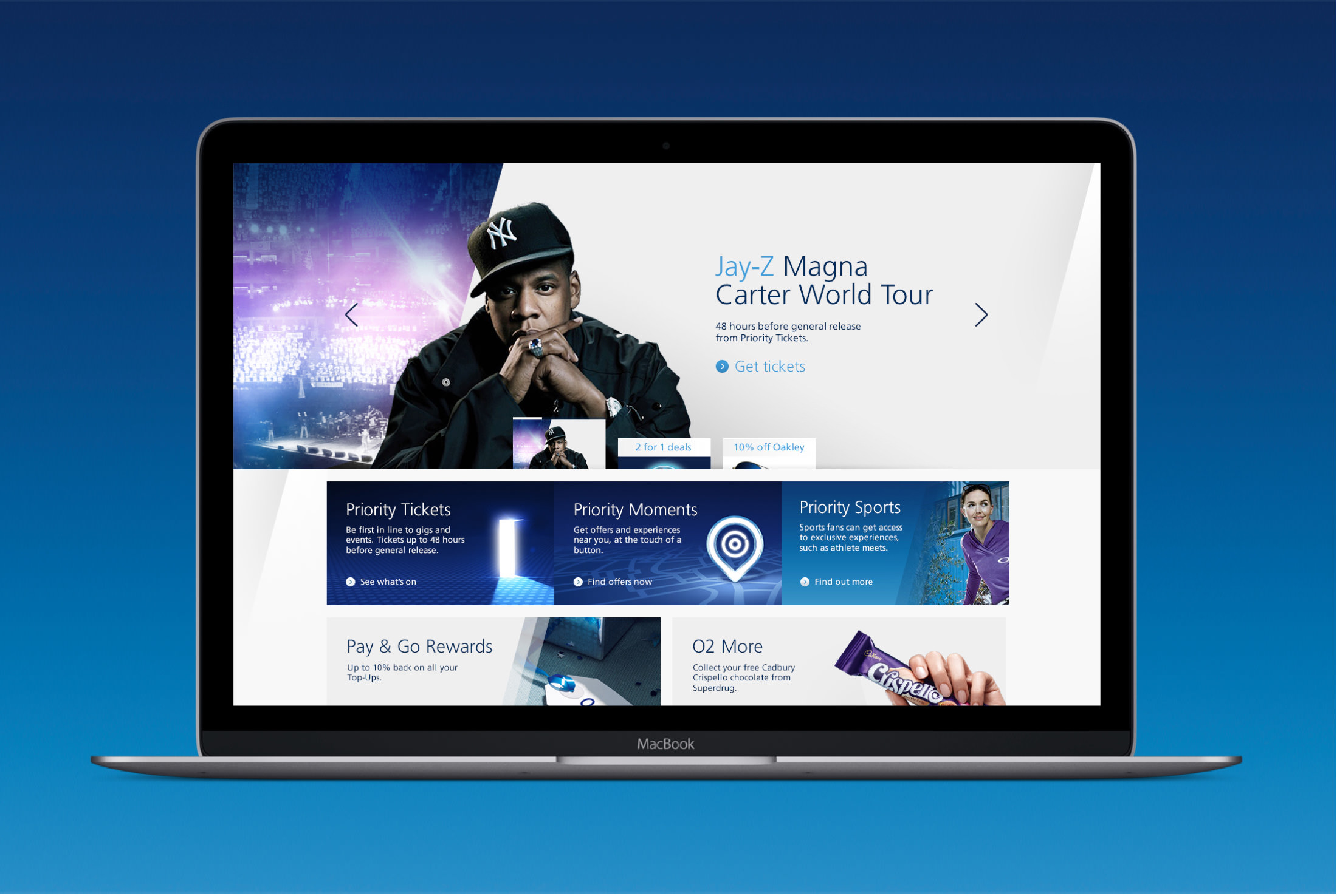
The vision for the website was for it to be simple, clean, with space to breathe. With the focus on it being touch friendly, we wanted it to resemble a glossy magazine with large touch points.
A modular approach was adopted for the site, which helped with the responsive behavior. Modules were sized up in t-shirt sizes (xxl, xl, l, m, s, xs) which correlated to percentages.
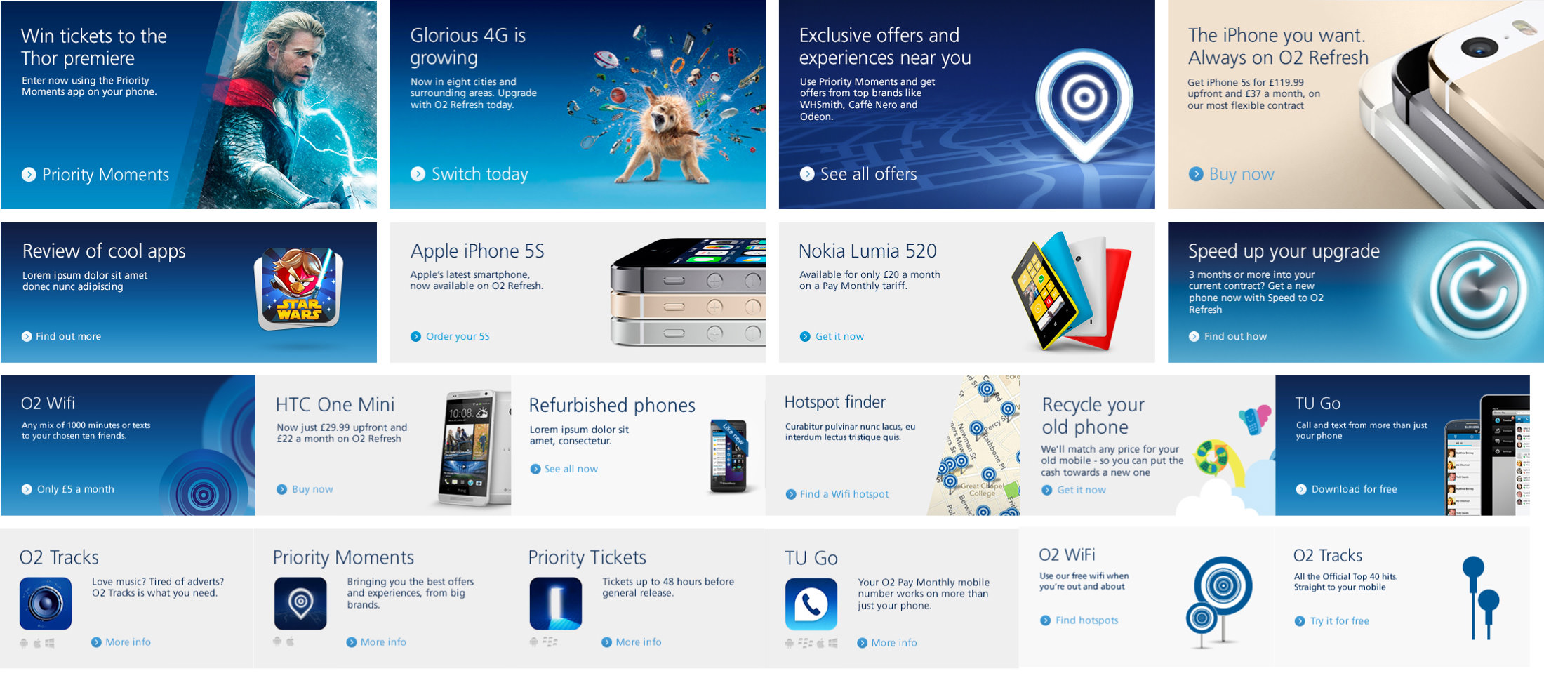
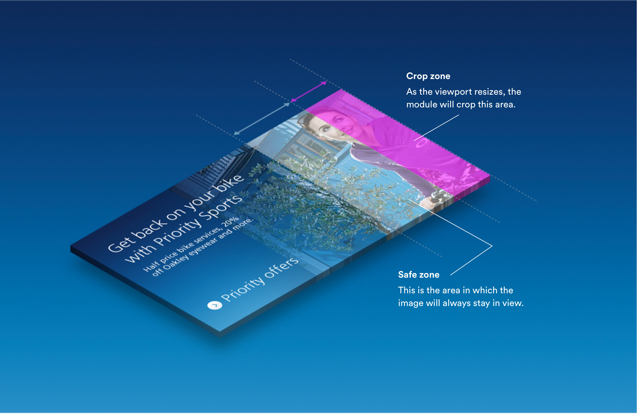
The idea was to avoid simply stacking an image with text as with a lot of modular responsive sites. Modules were set with text sitting on the image itself.
It was important therefore to understand where the image would crop, where the safe zone was and how the module would behave responsively.
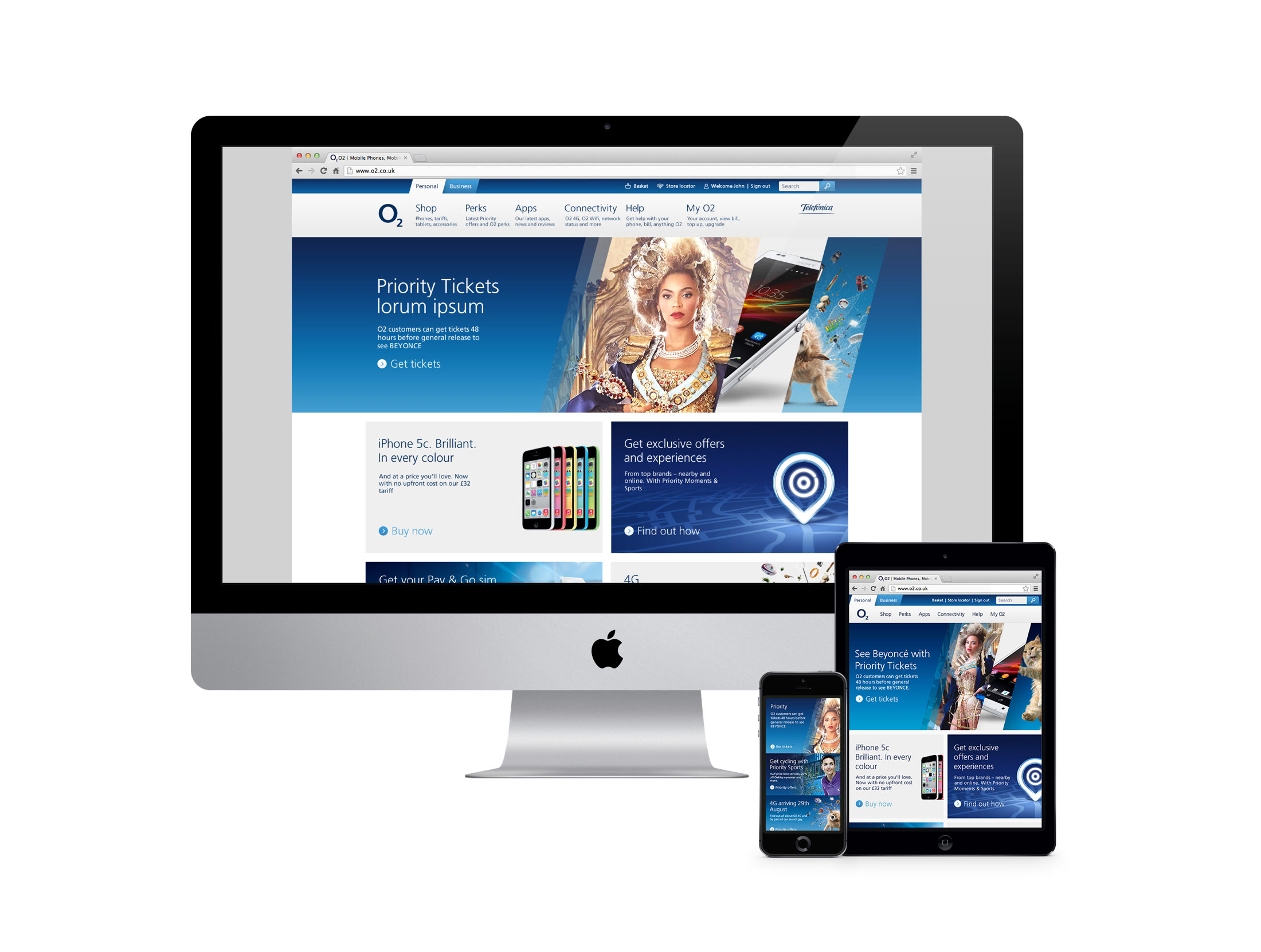
The site adhered to the following main breakpoints: 320px-574px, 575px-814px, 815px-1099px and 1100-infinity.
We firstly designed modules and then template pages. These pages were designed at 320px, 1100px and for trickier pages 575px.