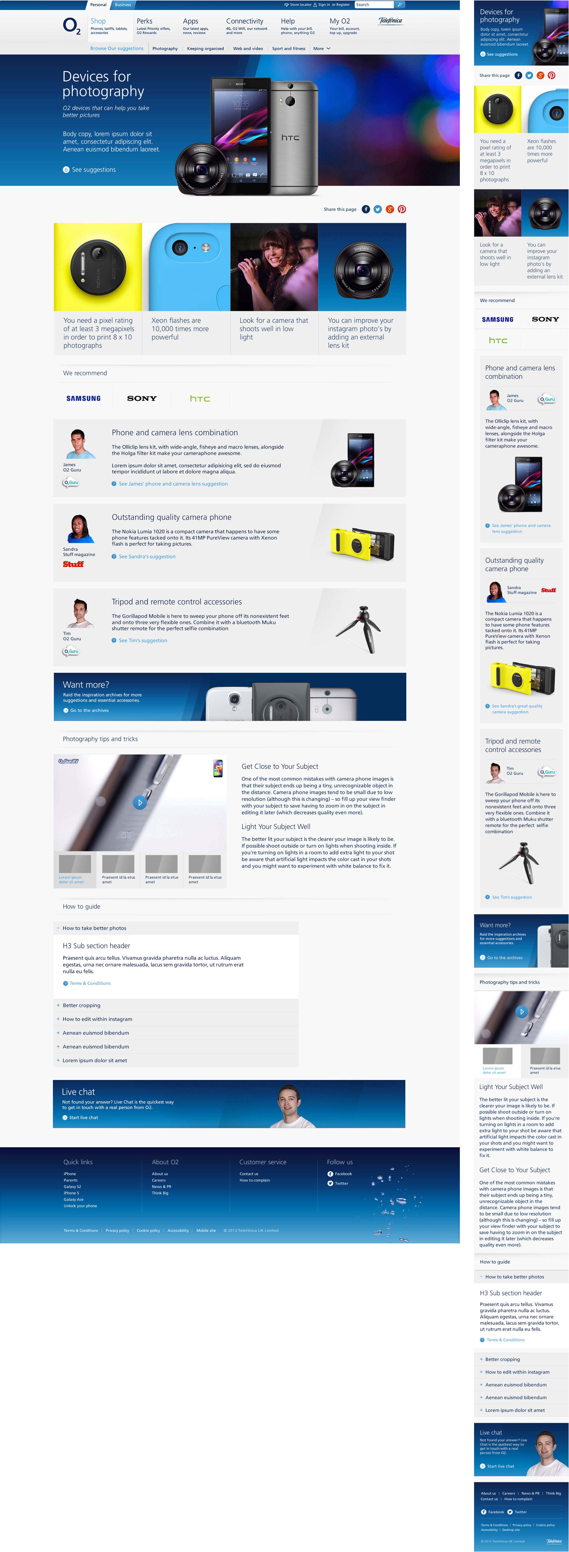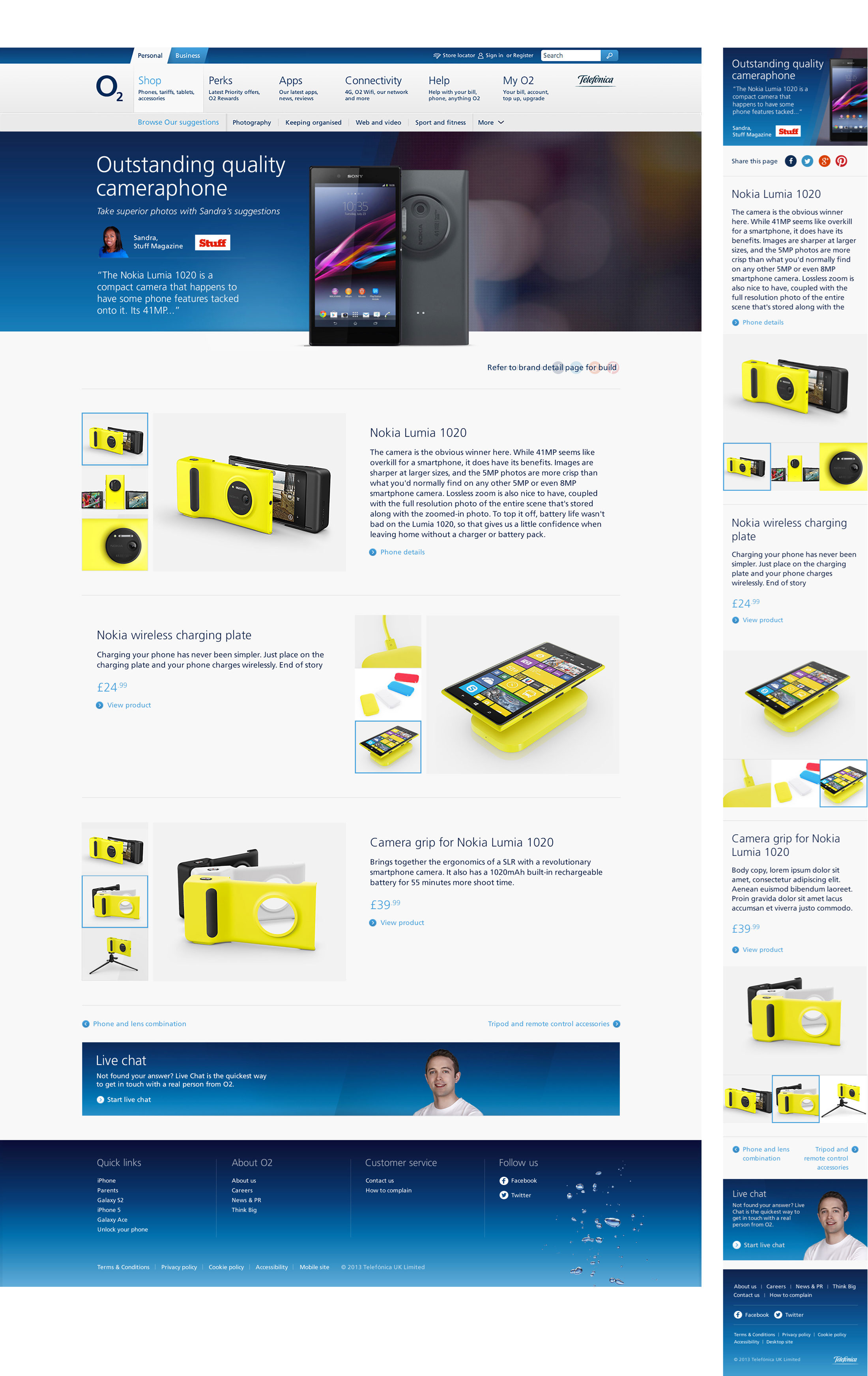
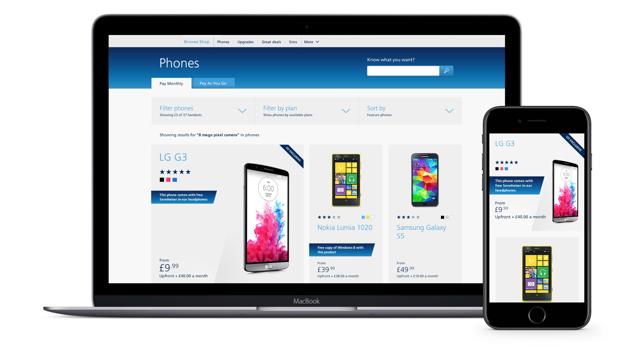
Having updated the portal website, the next step was to update and bring in line the shop journey. Again I had the opportunity to work alongside Tribal DDB in delivering a customer focused user journey.
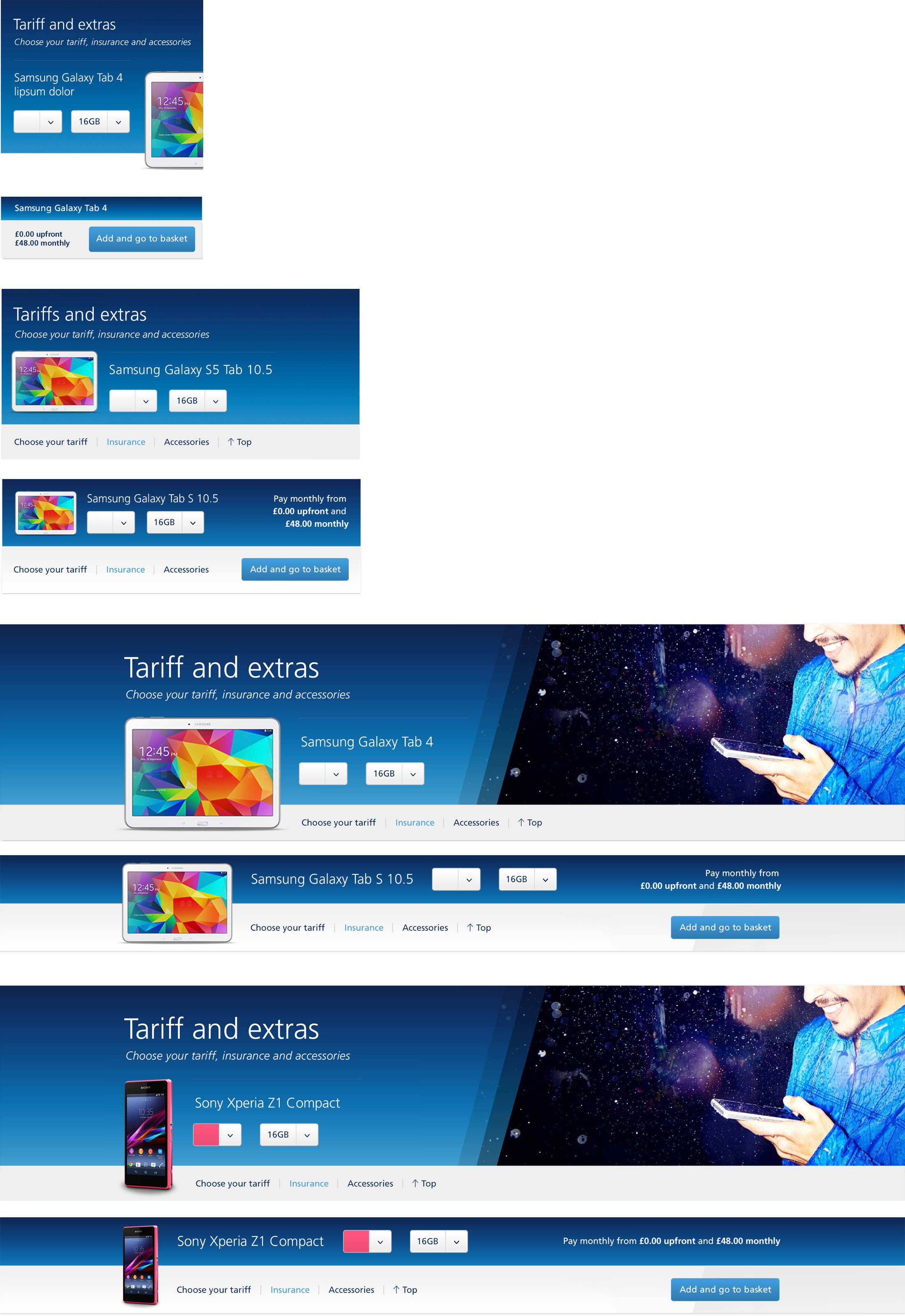
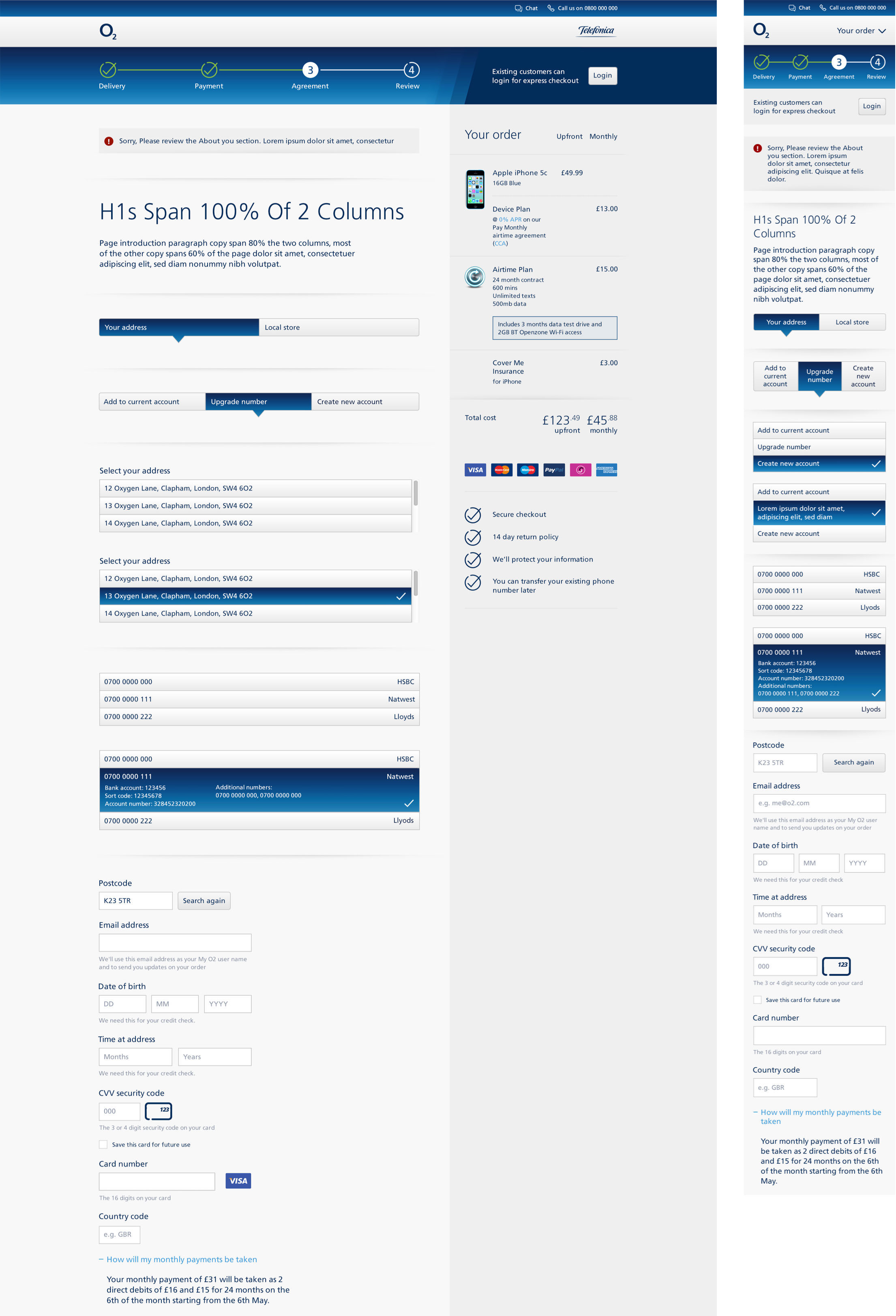
We worked hard to establish a consistent design language from the responsive portal redesign. Now we needed to expand our UI toolkit to create new form elements and basket specific UI.
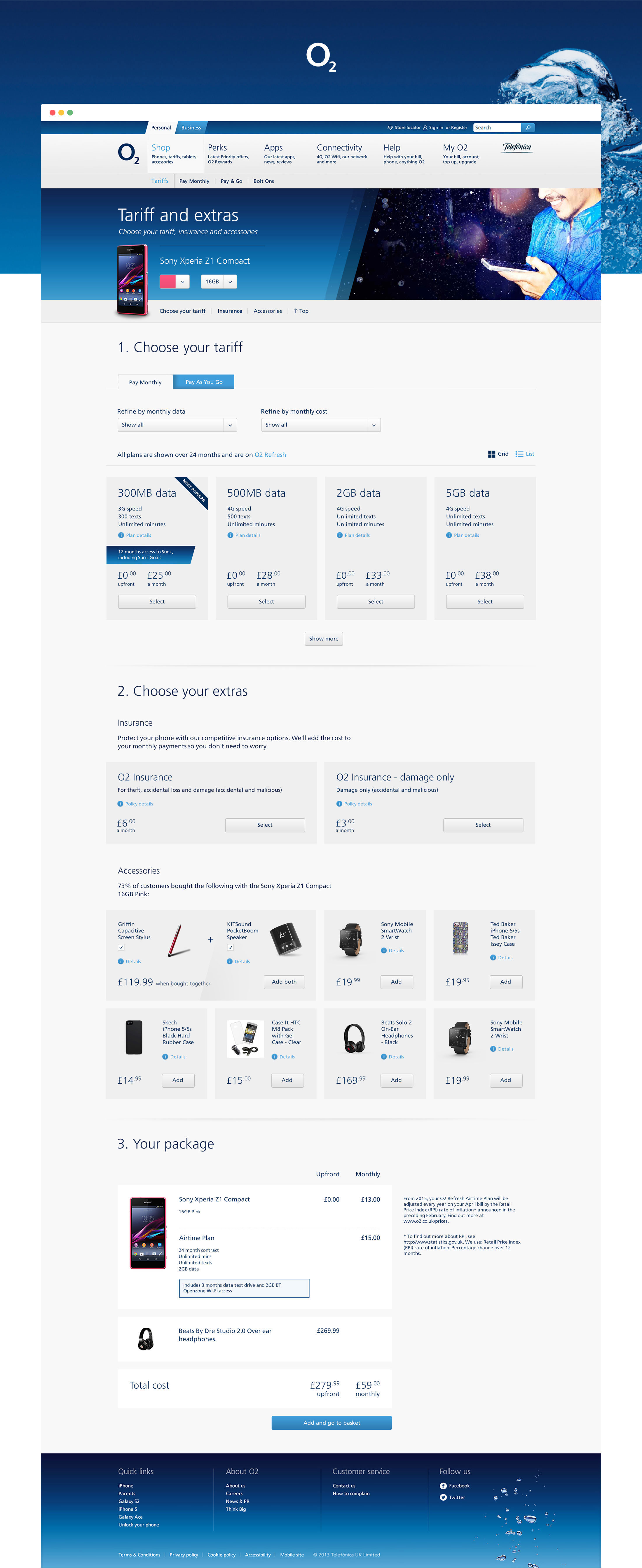
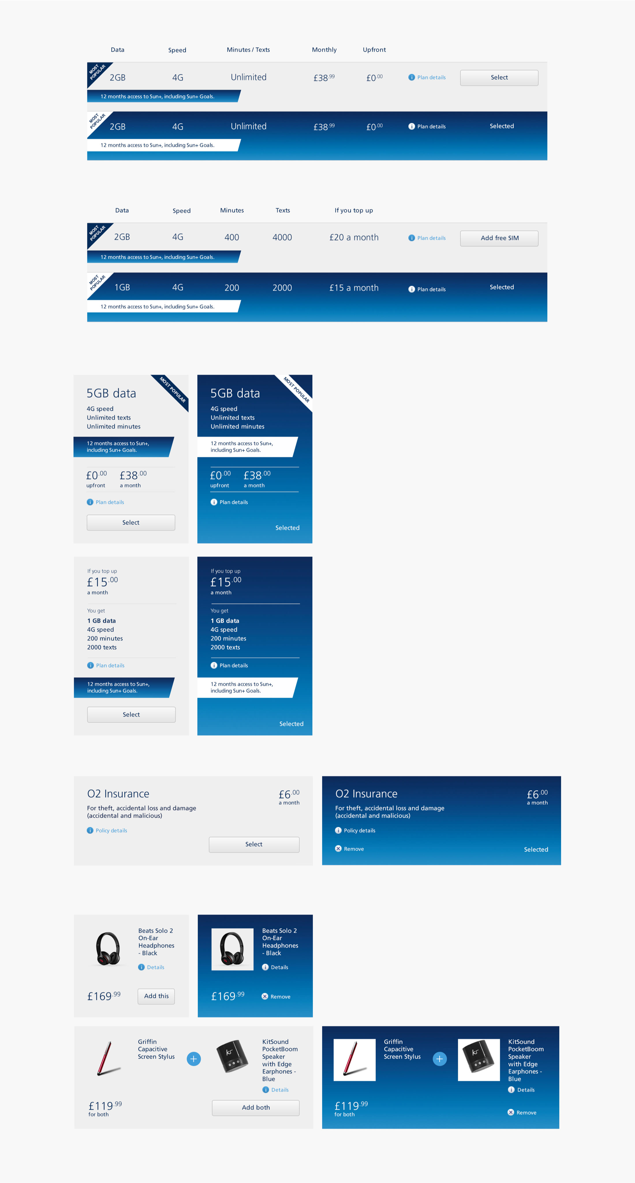
Selling phone plans requires users being able to easily scan through a page of plans and quickly deciding what suits them. Key UI components like these can take hours of iterating and several versions to finally solve the design problem.
The blue gradient is synonymous with o2 and we used it to highlight “selected” states as the user configured their plan. These light and dark states are shown below.
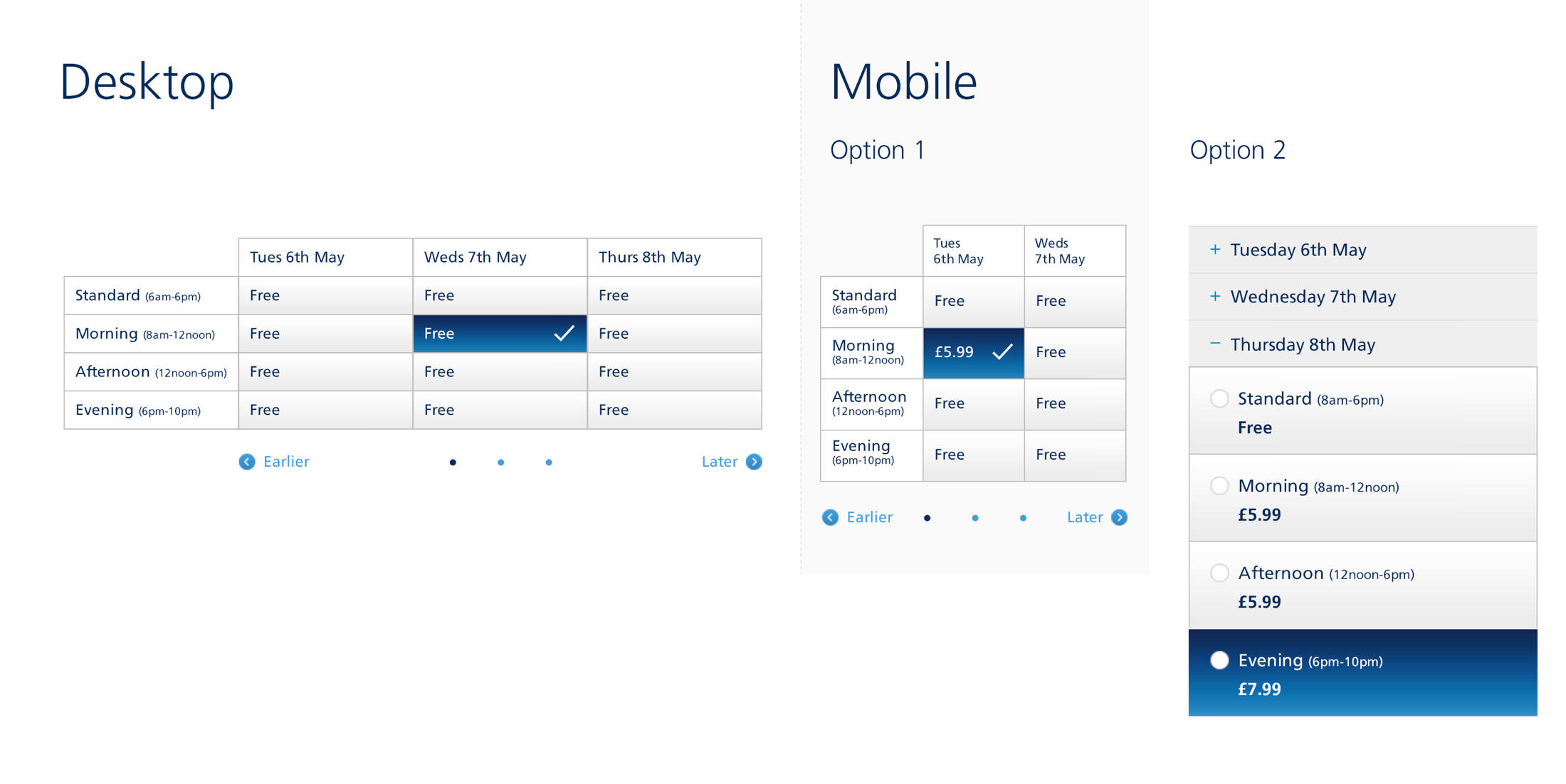
Each component was carefully designed at mobile, tablet and desktop ensuring it was fit for purpose. (Tablets could be shown horizontally and phones vertically)